
This is What Great SaaS Onboarding Emails Look Like
When I sat down to write about the best onboarding email designs, I thought, “Am I even qualified to write about this topic? I don’t design emails, and I’m not a designer, period.”

But then I realized something. Most people aren’t designers, and most people don’t design emails. I want to give serious props to those who make the world and ideas look good. But the reality is that most people looking at emails aren’t what they would consider “design savvy.”
So in that way, I am qualified to talk about the best onboarding email designs. Not as a designer, but as an average person who takes emails in.
There's a time and place for appreciating high design, but the typical SaaS user going about their day isn’t in that time or place. What SaaS users can understand, though, is a simple and effective design that supports the message of the email and, ultimately, their goals.
(P.S. if any email design friends are reading this, please forgive me if you find my perspective terrible)
With that said, let’s dive into what great onboarding email design looks like.
What Onboarding Email Design Needs to Accomplish
Design isn’t great only when it looks good - in the case of SaaS emails, it also needs to do a job. Before diving into examples of excellent emails, I thought it was important to set up a way to measure effectiveness. Here are three tasks each onboarding email needs to accomplish.
Connect the User to the Brand
Onboarding is all about getting new users up to speed and establishing your brand as a valuable partner in achieving their goals. For this mission, creating a clear brand identity is helpful. Having consistent branding through colors, fonts, and imagery to solidify the personality of your company can increase brand recognition and trust.
Give Context to the Message
Emails also offer visual cues that compliment the message and goal of the email. Product shots, animations, or illustrations add an extra level of explanation to an email. Plus, they are an eye-catching way to let someone know what the email is about (and whether or not they care to read more) within the first few seconds.
Move People into the App
Onboarding emails are a bridge between being outside of the app and engaging with features inside the app. Think of them as a launching pad! Therefore, design needs to work alongside copy to propel someone into action.
Common Onboarding Email Designs
Before highlighting a few particularly excellent onboarding email designs, I thought it would be interesting to pull out common themes I’ve found from analyzing 16+ onboarding series. I decided the easiest way to organize the emails are by length, along with a few other design elements.
Short and Sweet
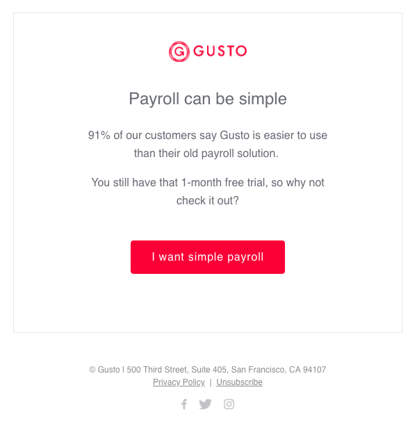
The simplest of onboarding emails are short and to the point. These include plain text designs that are simple body copy plus a CTA, or look something like the example from Gusto below. Short and sweet onboarding emails tend to follow the formula of headline -> image -> body copy -> CTA button.

Gusto starts their email with their logo (hooray for branding), a cute headline, an unconventional illustration, a short explanation, and a bold CTA button.
Don’t have trendy illustrations? Don’t sweat it. Not all onboarding emails feature an image, as you can see below.
Multiple-Sectioned Mediums
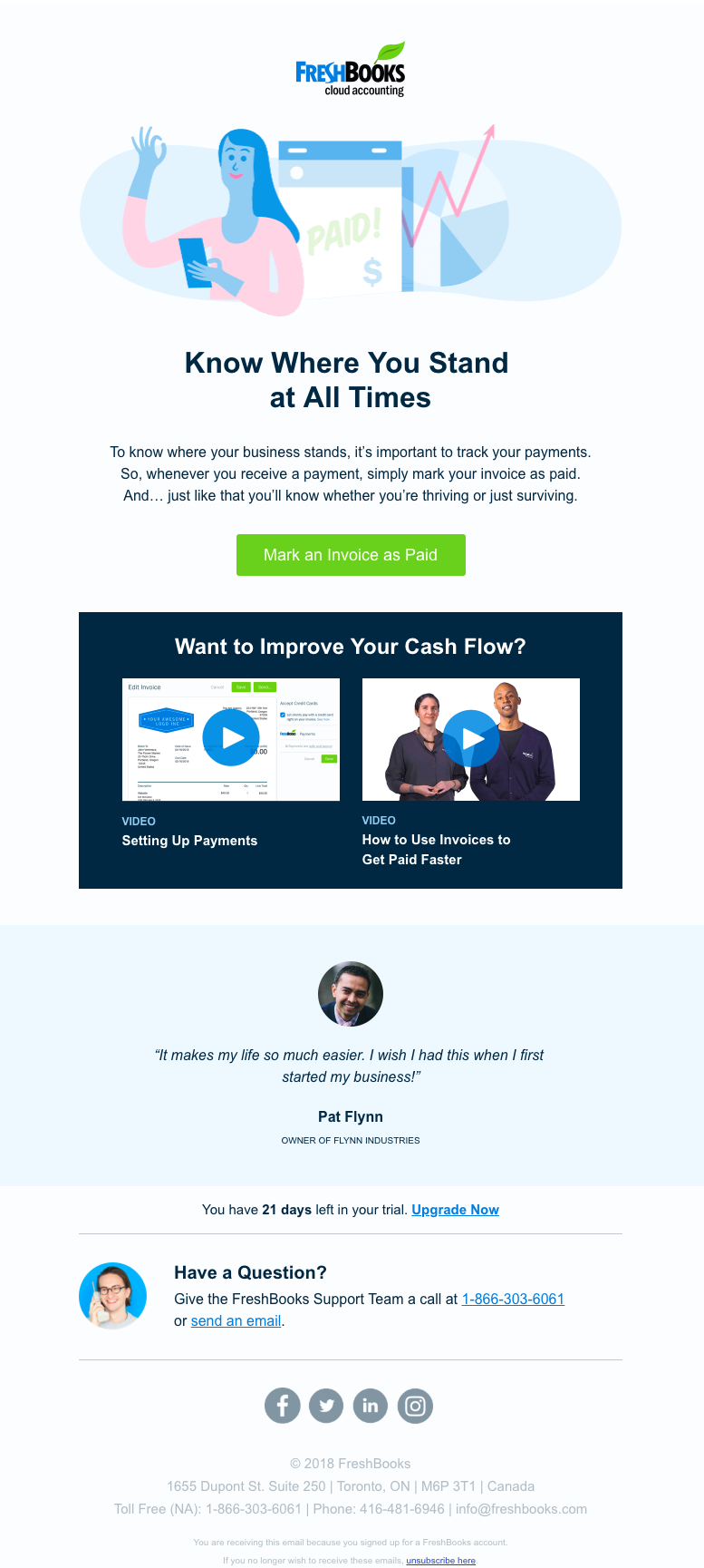
Some companies choose to use onboarding email templates with a few different sections. The top portion often follows a similar structure to the short and sweet variety. On the bottom half of the email, you’ll find content that follows the same structure from email to email.
For example, FreshBooks chooses to feature supporting videos and customer quotes in their onboarding emails. The top portion is business as usual—an image, headline, some body copy, and a nice CTA button. Then, FreshBooks includes a few related videos along with a section with a great social-proof quote from Pat Flynn. This same template (including the customer support info at the bottom) appears throughout the series.
MailChimp is another company that uses onboarding emails with a few distinct sections. Each email has the MailChimp logo, body copy, a CTA button, and a product image. Next, they link to resources and support to help the user implement the feature.

Long-Form Letters
Very long onboarding emails aren’t as common as short or medium ones. I have noticed that if there’s a long email, it’s usually the welcome email with a bunch of different CTA options.
I found examples of messages that go on and on from Grammarly and Monday. Just like the medium-length messages, these long-form emails start the same as short messages, but tack on a few different sections.
The Grammarly email below has the same basic features at the top of the email, like a logo, image, and some text. The email continues on with sections about different extensions, use cases, settings options, and even a CTA to upgrade to unlock all features.

Monday takes a more cohesive approach to long emails. Rather than having sections that cover a bunch of different topics underneath the standard top section, they use the rest of the email to expand on the same issue. Each colorful section features a story and template used by a real team, which ties into the top part.

Other Design Elements + Themes
Aside from email length and structure, there are a few different themes and styles that pop up often.
Those Cartoon People
I couldn’t talk about SaaS design and NOT mention the illustrated people. You know what I’m talking about because they’re everywhere. Okay, maybe not EVERYWHERE, but I see them on SaaS websites and emails often.


Animations
Another recurring design element in SaaS onboarding emails are animations. Sometimes they show off the product or a concept. Other times they’re just for fun.


10 Examples of Great Onboarding Email Design
We know that SaaS onboarding emails come in all shapes, sizes, and varieties, but now it’s time to shine a spotlight on some prime design examples. Along with commentary on why the email made it onto the list, I’ll be rating each email out of five pizzas (instead of stars) on the three things each email needs to accomplish.
Gusto
In case you haven’t noticed, Gusto emails have already been featured a few times in this post. Their emails are short but effective and have a distinctive style throughout.

Connect the User to the Brand: 🍕🍕🍕🍕🍕
Gusto is good about sticking to the same red and light blue colors throughout, always prominently featuring their logo, and maintaining a consistent illustration style.
Give Context to the Message: 🍕🍕🍕🍕
I don’t think every email image ever needs to be a literal translation, so I like the cartoon featuring an employee file. It’s related, but still maintains some of the whimsy that the brand likes.
Move People into the App: 🍕🍕🍕🍕
I gave this email three out of five pizzas for “moving people into the app” because it has that beautiful red button that’s hard to miss.
Wistia
Here’s yet another design that’s already made an appearance earlier in the post. Wistia’s welcome email features a poem and an adorable animation with a marching puppy, and I’ll never stop talking about it, okay?

Connect the User to the Brand: 🍕🍕🍕🍕🍕
Though the Wistia onboarding emails used a few different background colors throughout the series, the template remained the same. The logo is also repeated a few times. The star of this email, though, is the amazing marching animation at the top. Right away, I know this isn’t a stuffy brand, and the unique animation stands out in my mind.
Give Context to the Message: 🍕🍕🍕🍕🍕
The animation at the top is celebratory, and so is the main message. It’s a welcome message that gets people excited to get started.
Move People into the App: 🍕🍕🍕🍕
The white space (and muted CTA button) let the poem shine forward in the top section. Then, when it’s time to get down to business, the Wistia logo, mission, and CTA button appear on a bolder background.
Sprout Social
Putting a lot of information into a single email can lead to a visually overwhelming design. In the email from Sprout Social below, the line coming from the computer next to the first point helps guide the eye down to the second point. While there is a lot going on in this email, the combination of visuals and texts makes it flow.

Connect the User to the Brand: 🍕🍕🍕🍕
I may just be partial to the color green, but I like the colors and how they’re used throughout the email.
Give Context to the Message: 🍕🍕🍕🍕
This email is packed with info, so it’s helpful to break it down section by section. The choice of icons aligns nicely to what the text is saying, such as the computer with a play button next to mention of video tutorials.
Move People into the App: 🍕🍕🍕🍕
There are a few different CTA buttons that could catch a reader’s attention.
Zendesk
This onboarding email from Zendesk does a perfect job of using design to provide context. The progress bar lets users know where they’ve been (account created), where they are (connect your email), and where they’ll go next (answer tickets).

Connect the User to the Brand: 🍕🍕🍕🍕🍕
The Z Suite logo color is carried through in the headline and text font color, and the lighter blue seen in the product image also appears in the email. I also like that they have a product image that’s nice and big, and is being shown in a clean and organized environment. Maybe I’m reaching, but having the bright, clean desk next to the image of the app makes me feel like using the app will make me more organized.
Give Context to the Message: 🍕🍕🍕🍕🍕
Checklists and progress bars are some of my favorite ways that brands provide context during onboarding.
Move People into the App: 🍕🍕🍕🍕🍕
The combination of the copy and the progress bar makes it clear what’s on the other side of the CTA button, and the fact that you can’t progress to the next phase without completing this step.
Mint
Mint has great email animations. The simple GIFs allow them to fit more info into a small space and also add a little visual interest.
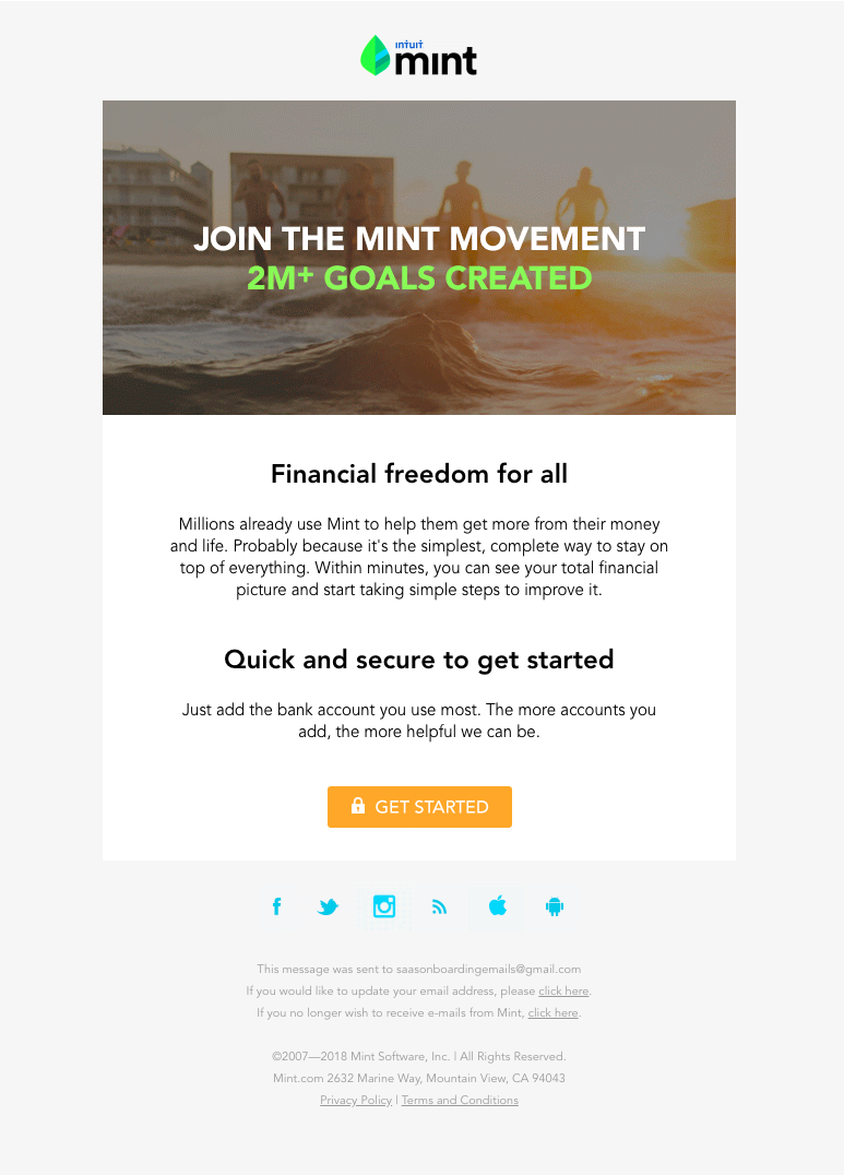

Connect the User to the Brand: 🍕🍕🍕🍕
The Mint onboarding series alternated between graphic emails featuring company colors, as well as lifestyle imagery. This particular email has more of the “carefree” life images.
Give Context to the Message: 🍕🍕🍕🍕🍕
The content of the email is about “financial freedom for all,” and Mint certainly lives up to that promise with their animation.
Move People into the App: 🍕🍕🍕🍕🍕
$6B+ saved is a pretty enticing number if you ask me. This email uses social proof to get someone to try Mint, and it does a good job.
Shopify
Shopify has some of my favorite onboarding emails, for content and design. They stick with a simple template and have really consistent styling between illustrations.

Connect the User to the Brand: 🍕🍕🍕🍕
Even though their onboarding emails are perfectly coordinated between each other, I have to admit I was expecting to see more Shopify green. After checking their website, it seems this purple is part of their brand identity, which is good because it is the color I came to associate with the company through these emails.
Give Context to the Message: 🍕🍕🍕🍕🍕
Shopify has illustrations that seem simple at first glance, but they actually have fun details in them. For example, this email is all about adding sales channels such as apps like Facebook. If you look closely, you’ll see a checkmark radiating off the person’s phone, along with a sales chart on the computer.
Move People into the App: 🍕🍕🍕🍕🍕
A person would join Shopify if they wanted to create a store and sell goods online. Therefore I imagine these illustrations are a nice mental connection to an outcome they want.
Flock
I love a good checklist, and Flock delivers! This checklist is a bit different from the Zendesk one because it isn’t filled with actual steps a user needs to take. However, this checklist helps a new user visualize and imagine their own projects and to-dos within Flock’s format.

Connect the User to the Brand: 🍕🍕🍕🍕🍕
It is very green.
Give Context to the Message: 🍕🍕🍕🍕🍕
This is another long email that thankfully has clear markers between sections and uses a design that complements the contents of each section. As I mentioned, I love the checklist.
Move People into the App: 🍕🍕🍕🍕
I mentally relate emails like this to having a lot of different fishing lines in the pond—they have a lot of different CTAs, and hopefully, one is interesting enough to click.
MindNode
While I don’t know that MindNode needed to fit everything (down to keyboard shortcuts) into a single email, the design makes the most of the information. I love that there’s a “⅓” at the top that set the expectation that there will be more related emails to look out for. The zig-zag placement of steps is also nice for scanning.

Connect the User to the Brand: 🍕🍕🍕🍕
The planting the seed imagery is great and directly ties into the logo and headline.
Give Context to the Message: 🍕🍕🍕🍕
While the screenshots next to each step technically give context to what they’re talking about, the seed planting at the top is really the star of this email. In parts two and three of this email sequence, the graphic narrative of planting a seed of an idea, helping it grow, and harvesting it continue.
Move People into the App: 🍕🍕🍕🍕
The red CTA button definitely stands out from the rest of the email.
HoneyBook
Not a fan of checklists? How about a progress bar! HoneyBook uses a round progress bar to motivate users to finish setting up their account.

Connect the User to the Brand: 🍕🍕🍕
The logo and color of the CTA button are true to the brand, but with the generic progress bar, there’s nothing that screams “HoneyBook” to me.
Give Context to the Message: 🍕🍕🍕🍕
This email has a “you’re so close” and “don’t stop now” vibe, so the progress bar is perfect. The copy is prompting someone to complete their account setup, and the progress bar perfectly complements that.
Move People into the App: 🍕🍕🍕🍕
Perhaps not everyone feels this way, but I think it’s satisfying to fill a progress bar or complete a checklist. If any imagery were going to make me complete an action, it’s this one.
Tinder
In this welcome email, Tinder proves that animations can be fun AND informative.

Connect the User to the Brand: 🍕🍕🍕🍕🍕
The animations aren’t too buttoned up, and I assume Tinder as a brand isn’t either.
Give Context to the Message: 🍕🍕🍕🍕🍕
What I love about the design in this email is that you don’t really need to look at the accompanying text to know what each section is talking about.
Move People into the App: 🍕🍕🍕🍕
There are a lot of different CTA buttons to choose from in this email, but I like that they chose to make only one a bold red.
Grammarly
Not every Grammarly onboarding email is long! This shorter email is focused on upgrading to a paid account and features social proof in the form of user stats.

Connect the User to the Brand: 🍕🍕🍕
Grammarly used a few different styles and imagery in their series, but the yellow button was pretty constant.
Give Context to the Message: 🍕🍕🍕🍕
The little lightning bolts play into the “supercharge” theme, but the design in this case really works alongside the copy to convince the user.
Move People into the App: 🍕🍕🍕🍕
The little stat designs do a good job of catching your attention so that you read the full stat.
Customer.io
Customer.io is a fan of the medium length emails that feature a recurring bottom section. When I’m collecting these emails I don’t interact with the app at all, but I wonder if the section with the little bird mascot would change based on where I was at in my onboarding process.

Connect the User to the Brand: 🍕🍕🍕🍕🍕
They’ve got the Customer.io blue on lock, and the bird cartoon was a recurring cast member in the onboarding emails.
Give Context to the Message: 🍕🍕🍕🍕🍕
Even if I didn’t read the accompanying text, the onboarding timeline graphic would let me know what this email is talking about.
Move People into the App: 🍕🍕🍕🍕
(If I were someone in the market for onboarding software) the chart plotting the steps from sign up to upgrade would be intriguing.
Ultimately, the “right” design for an email depends on the brand, customers, and email objective. Literal translations of the app or task at hand through product screenshots or samples are useful. But I also enjoy animations that are related, but not so serious. As with any marketing tactic, you’ll need to test different tactics to find out what works best for your customers.

What was your favorite email in the sequence? If you have any particularly awesome email examples, send me a message at hellostephknapp@gmail.com.


I compared 153 SaaS email subject lines to find common themes, best practices, and style choices.